Effect of an outlier on Regression Line
Just a small article to show the impact of an outlier in the direction of your dependent variable.
# Necessary imports
import pandas as pd
import seaborn as sns
# Lets define a small random dataset to prove our point
df = pd.DataFrame({'x': [1, 4, 5, 8, 10, 13], 'y': [3, 5, 8, 10, 15, 20]})
df
| x | y | |
|---|---|---|
| 0 | 1 | 3 |
| 1 | 4 | 5 |
| 2 | 5 | 8 |
| 3 | 8 | 10 |
| 4 | 10 | 15 |
| 5 | 13 | 20 |
# Lets plot the regression line b/w x and y where x is your independent variable and y is the dependent variable
sns.lmplot('x', 'y', df)
  <seaborn.axisgrid.FacetGrid at 0x1dd68a89ba8 >
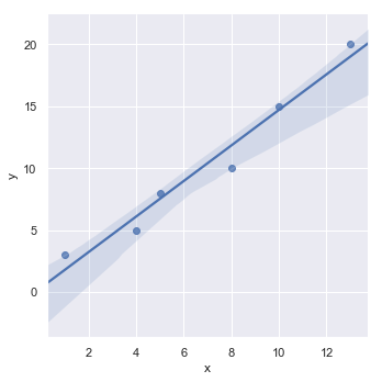
# Lets check the correlation b/w x and y
df.corr()
| x | y | |
|---|---|---|
| x | 1.000000 | 0.981795 |
| y | 0.981795 | 1.000000 |
We can see that the correlation is so strong between x and y. Let us now place an outlier in the direction of the dependent variable and see the effect of it on the correlation value
# Lets place an outlier in the direction of x-axis
df = pd.DataFrame({'x': [1, 4, 5, 8, 10, 13, 100],
                   'y': [3, 5, 8, 10, 15, 20, 5]})
df
| x | y | |
|---|---|---|
| 0 | 1 | 3 |
| 1 | 4 | 5 |
| 2 | 5 | 8 |
| 3 | 8 | 10 |
| 4 | 10 | 15 |
| 5 | 13 | 20 |
| 6 | 100 | 5 |
sns.lmplot('x', 'y', df)
  <seaborn.axisgrid.FacetGrid at 0x1dd68ad92b0 >
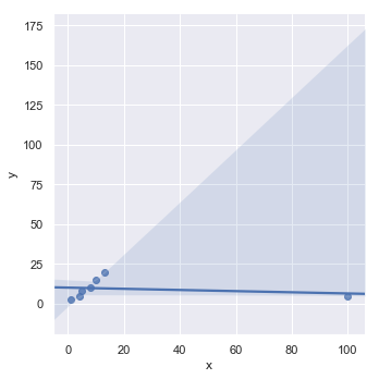
df.corr()
| x | y | |
|---|---|---|
| x | 1.000000 | -0.211966 |
| y | -0.211966 | 1.000000 |
The relation has gone from a very strong positive relation to a very weak negative relation. Hence, it is always a good idea to investigate those outliers in case of small datasets, they may point to a potential opportunity or in worst case, just drop them altogether as they can adversely affect the performance of your regression model.